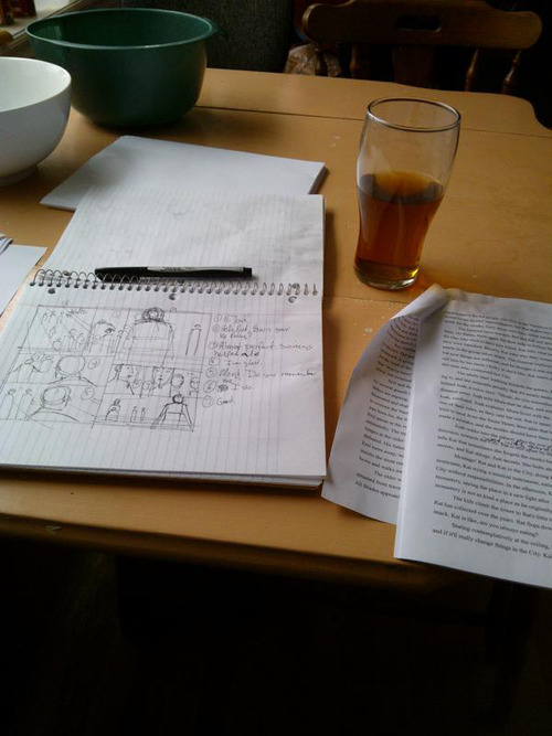
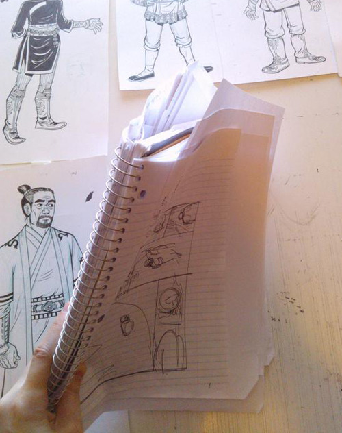
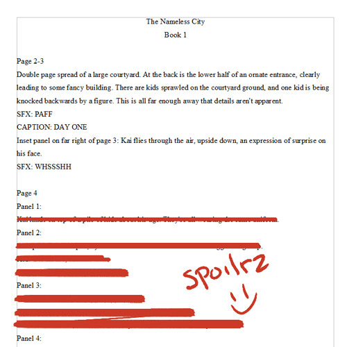
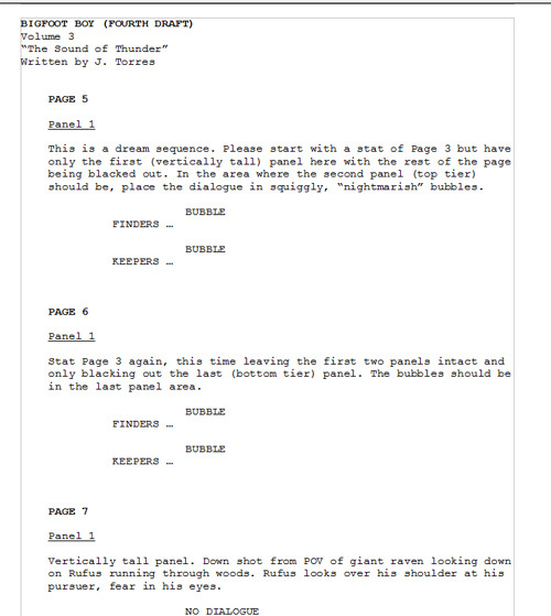
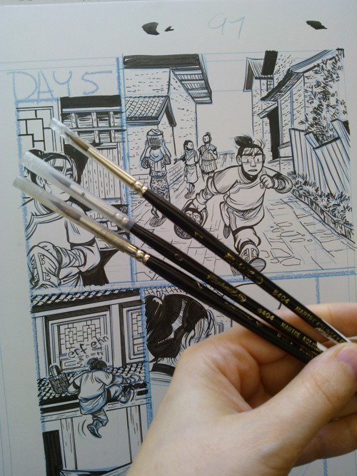
One of the reasons that I love comics so much is that there are many valid ways to approach the medium. When I make comics, the parts I’m most concerned with are character and story. Everything I draw on the comic page is in service to character and story. Because of my focus on those two elements over, say, experimenting with my art and page structure, I will sometimes get criticism that my work is safe or boring. This is probably fair criticism! I don’t do a lot of experimenting with paneling or challenging storytelling or explicitly challenging artwork in my comics, because right now that’s not what I’m interested in. Maybe I will be more experimental someday, but not right now, with the kind of stories I want to tell. 🙂
When I make a comic, my goal is for my readers to be engaged with the story I’m telling, and the characters in that story. That’s also what I look for when I want to read a good comic. I want characters to love, I want a story to be engaged with.
For the most part, I struggle with drawing comics (most artists do, if we’re honest ;)), but there are some parts of comics I think I have a good handle on. I feel like I’m strongest when portraying emotion on the page, and I’m good at drawing those scenes out and making the reader feel what my characters are going through. Some of the techniques I use to convey emotion came from being obsessed with movies when I was a teenager, and some techniques are stolen from my holy trinity of influences: Jeff Smith (Bone), Hiromu Arakawa (Fullmetal Alchemist) and Naoki Urasawa (Monster, Pluto, 20th Century Boys).
Of the three artists I’ve mentioned, I consider Urasawa especially to be a master of emotion and pacing. When I first started reading his comics, it was like light struck my brain; finally I saw what I’d been trying to do for years right there on the comic page in front of me! I like the way he lays out his emotional scenes a lot. Here’s an example (read right to left):
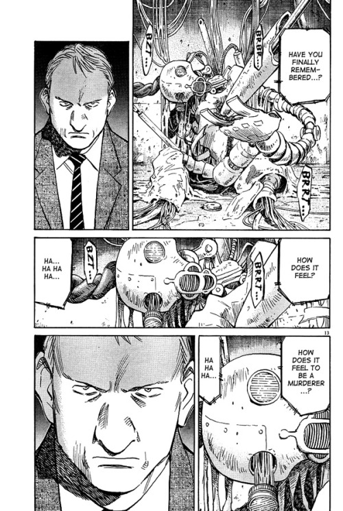
Urasawa uses repeating panels and decompression to draw out the emotions of a scene. In this single page there isn’t a lot of movement. It’s literally just two characters staring at each other, but the tension rises going from panel 1 to panel five. Gesicht (the man)’s expression doesn’t change between panels two and five, but we literally feel his anger rising off-panel, concluding in the close up in panel 5.
There’s an excellent You Tube channel called Every Frame a Painting (I’m sure you’ve heard of it, but if you haven’t, please go watch all the videos! There aren’t many, and they’re all really informative). My favourite video is this one, about editing:
This video hit on something that I strive for in my comics: emotion takes time. When I draw a scene that is emotional, when characters are struggling with something, or celebrating something, or being challenged, I want my readers to feel what the character is feeling, and one of the best ways to do that, for me, is to take my time. To give that emotion time to breathe on the page.
I’m going to use some scenes in my graphic novel The Nameless City to illustrate how I use decompression and pacing to underscore the emotion in my comics. To avoid spoilers and because this is getting a little long, I’m going to put it under a cut. Please read on! 🙂
Hello again! In The Nameless City, one of the main characters, Rat, lives in a monastery, because she’s an orphan. She seems to have a good relationship with one of the monks in particular, Joah. When we first see them together, they act like this:
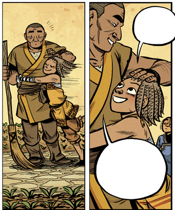
Up until this point in the story, Rat hasn’t been particularly nice or affectionate to anyone, but it’s different with Joah. And it’s hopefully obvious from these two panels that he’s fond of her too. Rat and Joah don’t have a lot of scenes together throughout the course of the book, so I use their body language to immediately establish their bond. Rat is very different with Joah than she is with Kai, who she’s either been mean to or openly mocked for most of their interactions.
There are a couple more scenes where Joah and Rat interact, and in those scenes I visually drive home their relationship. Rat is more of a kid around him, bouncing on her toes, asking if there’s anything to eat:
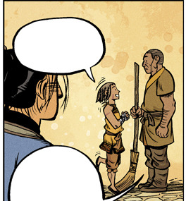
… and Joah’s kind of a dick to Kai at first, which Rat thinks is hilarious:
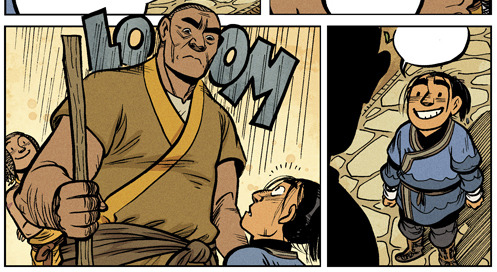
So basically we have a fairly straightforward Surrogate Dad & Daughter relationship. Rat’s parents are dead, and she comments that the monks are “nice,” but we don’t really see her interacting with anyone but Joah. He’s her connection to the monastery and the monks, and a tiny bit of parental oversight in her unsupervised life. Until he goes too far, and really tried to parent her, and Rat loses her shit:
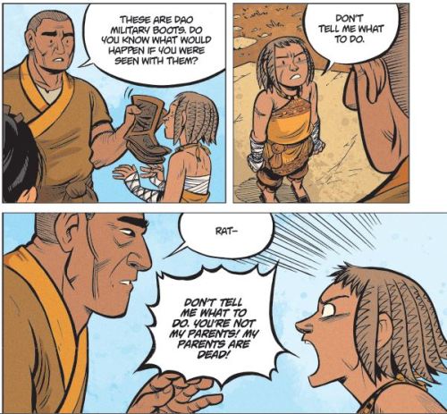
Oops.
Anyway, this very long set up finally brings us to this scene, which is where I get to unleash my love of decompression and silent emotional beats.
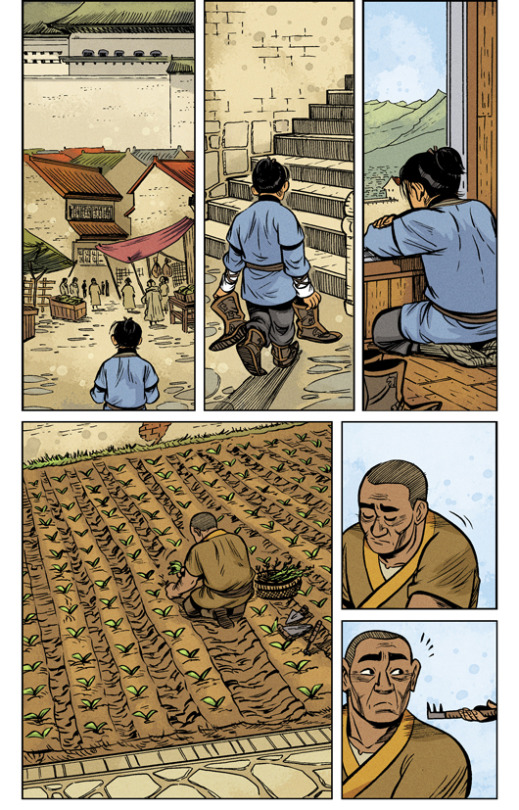
(Above is page 136 and below is page 137 in The Nameless City. Just wanted to be clear where the pages begin & end!)
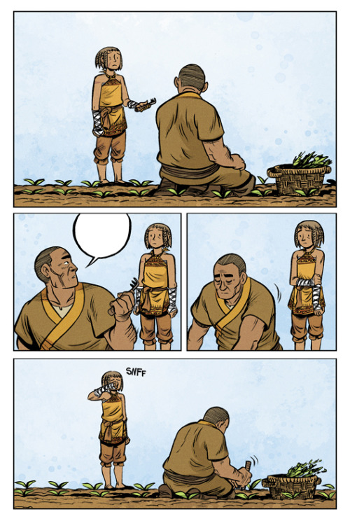
The story beats on these two pages are quite slow, and I spend two pages on a part of the story where it might be more efficient to use only one or two panels. There are many kinds of scenes where it is appropriate to speed things along more quickly (for example, a fight scene, or a scene where characters are doing something quickly), but for this particular scene, I wanted the fallout from Rat’s emotional outburst to be made very clear. Kai gets three silent panels at the beginning of page 136 to walk back to his home and stare out the window, thinking about his role in the fight, and Rat and Joah get a page and a half to deal (poorly) with their relationship.
The paneling of page 137 is particularly important. Comic paneling has kind of a rhythm to it, and in my own dumb shorthand, I think of widescreen panels (panels that reach horizontally across the length of the comic page) as “boom” panels. I know, it’s silly! But generally speaking, readers tend to spend more time looking at large panels, so they “read” as more important than smaller ones. Large panels slow the reader’s eye down. They’re basically like the cartoonist is saying “hey! There’s something extra important happening in this panel! Or here’s an establishing shot I spent six hours drawing!” The first and fourth panel of page 137 is me, the cartoonist, jumping in and being like “BOOM! pay attention to this emotional stuff! BOOM!” XD But here’s the tricky thing: overusing large panels can lessen their importance, which is why comics that only use full-page-width “widescreen panels” can look stagnant. It’s a complex balance.
My hope is that my readers will feel the emotional complexity of the relationship between these two characters on page 137. Through the paneling, through Rat’s body language, and through Joah’s body language. Up until this point, Rat and Joah seem to have a good relationship. He looks after her a little bit, and she seems very fond of him. Until she very pointedly reminded him that he’s not actually her parents and probably has no business telling her what to do. So at the start of page 137, Rat is trying to apologize, to make things as they were. But Joah just turns away from her and goes back to his gardening, leaving Rat standing beside him, starting to cry. The scene ends on this page, and we don’t see what happens afterwards. There is repetition in the wide “boom” panels at the top and bottom of the page, and the only dialogue spoken is Joah saying “thank you” in panel two.
Emotion takes time! If I had been super efficient with these pages and wrapped everything up in a couple of panels, I feel like this scene would have less impact. Hopefully when a reader looks at this page, they’ll feel something for these characters and their struggles. That is my goal with every graphic novel I create, to make you feel something. 🙂
Anyway! These are my thoughts on decompression, paneling and emotion in my comics. I hope you enjoyed them. 🙂

